Re-Design of Confimprese Logo
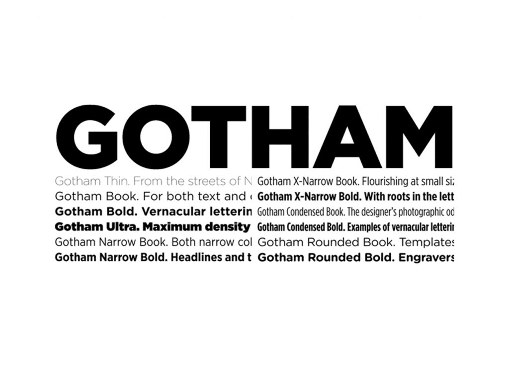
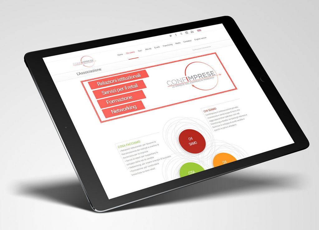
The design aims to modernize the old logo, while keeping the symbology behind it: the word “Imprese” has been designed with a stronger version of the font compared to the first part. The two arrows have been re-designed with a more obvious meaning: the first creates a circle around the word “Imprese”, to conceive an idea of proximity and collaboration; the second arrow instead is straight and towards the future, innovation and proactivity. The weight distribution of the logo is asymmetrical, leaning on the right, again to conceive the idea of dynamism and a look into the future of the association.


